 Singart
Impression Colouring Impressionism
With the “Colours of Impressionism: Masterpieces from the Musée d’Orsay” exhibition just opened at the National Gallery Singapore destined for Art Gallery of South Australia in Adelaide next from 29 March 2018, and the world renowned Paris art museum itself billing the show as a clarification of the context and the costs of development with which Impressionism appeared and evolved through its understanding and use of different colours between 1860s and 1910s to promote the entrenchment of the Impressionists’ art form and hence its future in the French art world then dominated by a style of painting where black prevailed, the over 60 artworks it displays bring together a group of artists with diverse experiences and intentions; ranging from the deep blacks of Édouard Manet’s Spanish-influenced paintings to the green and blue landscapes of Paul Cézanne and Claude Monet to the soft pinks of Pierre-Auguste Renoir’s classical female figures.
Through a hang dictated by a presentation of the ‘historic’ ascension and progression of Impressionism to Divisionism and the birth of Neo-Impressionism, the accompanying wall captions go to great lengths succinctly detailing causes and effects.
Hence, the prominence of black in French painting during the 1850s and 1860s is clearly attributed to the colour’s representation of the real world and the lives of ordinary people a la the dominant hue of suits worn by the emerging middle class as a symbol of daily modernity as the primary driver for Manet’s inspirational adoption of the skill with which Spanish painters Diego Rodríguez de Silva y Velázquez and Francisco de Gya applied to their use of this somber black; while the Impressionists’ first shift in its approach to representing light is accredited to the new artistic endeavour of painting landscapes through direct observation on site the newly elegant modernized Paris and its surrounding suburbs of wide boulevards, parks, squares and open vistas, as well as the rural French settings easily accessible for the first time by the then recently upgraded infrastructure.
This drove the artistic enthusiasm of depicting frosty wintry landscapes during the 1860s and 1870s as it encapsulated the challenge of capturing the subtle gradations of light on a monochromatic reflective blanket of delicate snow; the effect of light on snow all still closely studied and painted en plein in the depths of freezing conditions, especially after Gustave Courbet’s use of the lately commercialized saturated ultramarine blue to brush in the shadows falling on snowy landscapes caught on with the wide circulation of Johann Wolfgang von Geother, Michel-Eugene Chevreul, M.E. Brucke and Hermann von Helmholtz’s theory of complementary colours that proposed the sun’s emitted yellow-orange light required shadows be blue or violet.
This daring use of complementary colours to depict nature as seen on site at a given moment drove the Impressionists to discard the convention of conveying the local specific colours of objects unchanged by the contingent effects of light in favour of painting in other hues to the observed land- and seascapes to bring out the nuances of green; all thanks to the period in chemistry’s development of a range of synthetic pigments – ranging from bright emerald green and viridian to deep blues and violets – enabling these artists in expanding their palettes significantly by mixing them.
Twelve years later, in favour of a systematic division of primary colours to create optical mixtures, the Neo-Impressionists Georges Seurant, Paul Signac and Camille Pissarro’s son Lucien discarded this evolved technique. This time thanks to the continuing influence of Michel Eugène Chevreul’s theory of contrasting colours, James Clerk Maxwell’s experiments on colour mixing and Ogden Nicholas Rood’s colour circle; birthing the methodical juxtaposing of small brushstrokes of complementary unmixed hues that respond to and invigorate each other – namely Divisionism, from which Pointillism off-shot.
This evolution took a further turn in the late 19th century alongside avant-garde literature where ideas and meanings were conveyed through symbolic imagery and suggestion, rather than a simple representation of the world. Colour became less referential to the depicted object and more defined by the painters’ personality. Hence Monet’s painting of the fleeting light at different times of day of the Rouen Cathedral from 1892 to 1894 and of the Vétheuil on the river Seine in 1901 now expressed his memory of a melancholic mood.
This dissolution of the image is further extended by Cézanne and Henri-Edmond Cross into block-like forms and harsh strokes of bright colour to reflect direct systematic sensory experiences of nature while staying autonomous from it – the first stirrings of Cubism and Fauvism.
At the same time, Renoir and Berthe Morisot’s softening of their colour palettes with white’s addition represented the shift back to portraiture, as inspired by 18th century Rococo painters’ partiality towards delicate tones and voluptuous feminine subjects, and subsequently by those pigmented further back during the Renaissance and Baroque time frames.
Viewed from this platform, the National Gallery Singapore’s concurrent exhibition “Between Worlds: Raden Saleh & Juan Luna” of the famed Indonesian and Filipino artists’ more than 80 works of art created too during the 1800s in Europe and in their respective homelands, and presently housed in important collections across the globe, attempts to illuminate the wider socio-political 19th century contexts of Europe and Southeast Asia during this time of enormous change.
Yet the salient instinctive lasting impression left by “Between Worlds” is that of Raden Saleh’s early tutelage in Indonesia under Antoine Payen, a respected landscape painter employed by the Dutch colonial administration for 15 years from 1815 to depict the views of the Dutch East Indies, which included the natural landscape, archaeological sites and every day scenes of kampong life to promote the region as attractive to not just officials of the Dutch Government, fortune hunters and ‘scum’.
Done in the 1820s, Payen’s “the Great Postal Route Near Rajapolah” displayed in this concurrent show demonstrated his skillfully arranged gradations with air and light pouring profusely through and with details treated with infinite care; offering the Romanticism that became encapsulated with the artistic Dutch colonial period’s Mooi Indies – all things pretty about its part of Asia.
Unfortunately, all his Dutch government commissioned paintings were deemed too colonial – that is, not European enough – to be welcomed by the newly opened Museum of Modern Masters in Haarlem in 1838; becoming relegated to the Museum of Ethnology in Leiden to be ‘forgotten’ by the evolving European visual art world in the 1800s to this day.
I cannot help but wonder if it had been the French who had colonized the East Indies back then, would Payen’s Mooi Indies skill with the tropic’s dazzling light on its landscapes have had any impact on the development of Impressionism in France in the later 1800s…
If this thought seeds your rumination too, view “Between Worlds” first before going on to explore “Colours of Impressionism” at National Gallery Singapore, 1 St Andrew’s Road, #01-01, Singapore 178957 before they end on 11 March 2018.
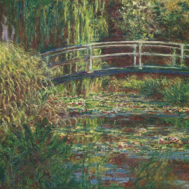
Feature Image:
Claude Monet’s “Water Lily Pond, Pink Harmony” © RMN-Grand Palais (Musée d’Orsay)/Hervé Lewandowski.
